From Broken Onboardingto Freemium Growth
Aboutthe project
Business Context
EVBox Everon is a SaaS platform for managing EV charging networks. The company was shifting to freemium. A new hardware generation was launching with a hard deadline. And onboarding was fundamentally broken.
Challenge
Redesign onboarding to enable freemium, reduce support load, and serve user segments that had no path at all.
My Design Footprint
- Led a team of 3 designers
- Owned onboarding across web and mobile
- Designed end-to-end onboarding on behalf for resellers
- Designed end-to-end onboarding for residential station owners
- Ran usability testing across all segments
- Aligned Product, Engineering, and Marketing
Outcomethat matters
Outcome
- 75% fewer support ticketsThe top-3 category — irreversible account type errors — effectively disappeared.
- 66% faster account activationMandatory inputs reduced from 23 to 8.
- Freemium model launched on scheduleNew acquisition path unlocked on the hardware deadline.
Trade-offs
Not everything landed where I wanted it:
- Address field stayedHome owners entered their station address before getting any value. Backend constraint kept it in. I accepted it too quickly.
- Migration left to engineeringI focused on the new flows and trusted engineering to own the migration path. Wrong division of responsibility.
- Residential monetisation untestedFree vs paid tier needed user research before launch, not after. Converting home owners to paid remains unsolved.
From ProblemTo Solution
The problem
It seemed the problem was on the surface:
- Account creation issuesA top-3 support ticket category.
- Wrong account type creation48% of all issues within the account-creation category.
- Longest resolution timeWrong account type selection was irreversible. Each case required multiple support–user interactions.
These were symptoms, not the root problem. Support ticket analysis and 13 user interviews across segments surfaced three broken paths:
- Business usersConfused by account taxonomy. “Business” vs “consumer” didn't match their world. Wrong choices were irreversible.
- Reseller partnersNo legitimate path to set up client accounts. Partners logged in with shared passwords. A real security problem nobody had solved.
- Residential usersLease drivers skipped invitations and created wrong accounts. Home owners had no dedicated path — a whole segment, invisible.
The problem wasn't the flow. It was the questions inside it and the paths that didn't exist.
DesignDecisions
Design principles
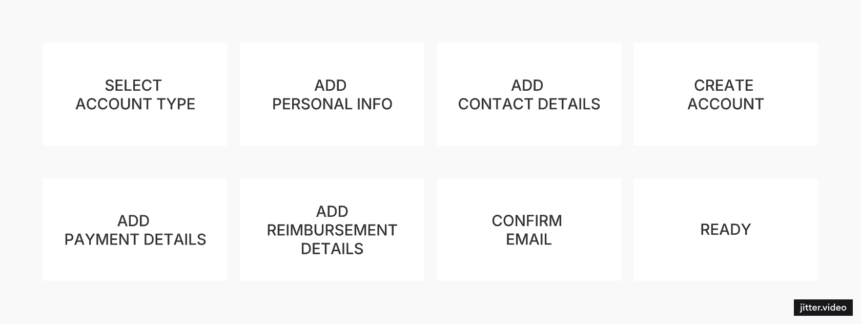
Three principles guided every design decision:
- Split the flow into meaningful sub-flows — Account creation, Subscription selection, Reimbursement details, etc.
- Define which sub-flow is needed in the user context
- Define which data is required for each sub-flow
- Request user input at the moment it becomes necessary, not upfront
Frame decisions around questions users can answer confidently.
The original flow asked users to select their account type. Business or consumer. The labels didn't match how users thought about themselves. Wrong choices were irreversible.
- Added routing question before account creation: "How did you get your charging station?" Lease drivers wait for invitation, owners continue. Lease drivers never enter the wrong flow.
- Removed account type selection entirely. Enabling Business subscription is what makes an account a business account. No classification step, no wrong choice.
Optimize experiences around user context, not platform parity.
- The web portal enables complex business workflows.
- The mobile app is intentionally simplified for home owners — no upfront subscription step.
Iterations and trade-offs
All flows went through several rounds of usability testing. User feedback shaped specific changes. Here are some that mattered most.
The end of account activation offered two main options at once: activate station, activate card. Users froze.
“What should I do now? Should add station first? Or card?”
I replaced it with two separate screens — one option at a time.

Subscription selection during onboarding turned out to be a friction point. Everyone continued on the free tier anyway.
“Why do I see this now? I didn't even get any value yet.”
Removed subscription selection from mobile onboarding entirely. Upgrade options appear later in the app, once users have a reason to care.

Client acceptance of terms is required before assets can be activated. This added friction but ensured legal compliance — a trade-off we accepted deliberately.
Watch itMOVE
Self sign-up
Mobile app
- Home owners create account by adding name, country, email and password
- Once email address verified, they can activate their assets
- No subscription selection
Onboarding on behalf
Reseller — Web
- Reseller creates an account on behalf of the Client
- After the Client reviews and accepts the terms, the reseller can add assets for them
Onboarding on behalf
Client — Web
- Client follows the email invitation, reviews the subscription, and accepts the terms
- Once the subscription is active, they can add assets themselves or ask the Reseller to do it for them